Thumbnail
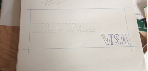
For this painting I used the inspiration word from Illustration Friday, "Urban". I decided to do a mock billboard for Visa. When I thought of "Urban" I thought of Hollywood. The billboard reader has 4 seconds to take in the concept of the billboard information. The Hollywood sign was a good concept for Visa/ the billboard as you look at it and can make your own thoughts from it; a trip or living your dreams. This image is my thumbnail for the billboard.
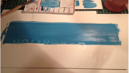
Painting the Sky
I illustrated my Hollywood sign and Visa logo on the illustration board. From there I painted both the text pieces with rubber cement. I did this so I could paint right over the text without actually colouring it. In this picture, I am painting the sky with Gouache paint.

Painting the Grass
Next, I started painting the grass. First I painted a wash of green over the entire bottom of the board. Then I took a rough sponge and created some texture to make it look more like grass.
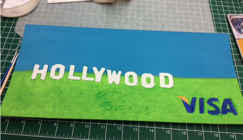
Finished
After I painted the sky and grass, I removed the rubber cement over the text. Then I used a white gouache paint for the "Hollywood" sing. Then I mixed my paint with the colours of the Visa logo. After, I put some finishing touches on the painting by adding a thin black line on the sides of the text from the "Hollywood" sign. Just to make it pop a bit more. This is a picture of my finished billboard.